Client
Type
My Role
Duration
Full-stack product designer who took "only a name" and built a complete brand identity, informational website, and scalable packaging system for a premium FMCG jaggery brand. 100,000+ boxes sold, 10,000+ repeat customers, 700+ retailers in under a year—driven by clarity, premium positioning and trust-first design.


Problem Definition
I transformed a founder's vision and validated brand name into a complete, market-ready identity system — across brand, product & communication — from the ground up.
The project started with fragmentation.
The brand lacked a clear visual language, the product experience was not there and there was no consistent way the business showed up across all social/digital platforms.
The core challenge wasn’t just creating a brand or designing screens — it was bringing clarity to a product that needed to move from idea to market without losing consistency, intent, or usability.
The core problem became — a design system that could align brand expression, interface behaviour and future product growth.
My Scope (Delivered):
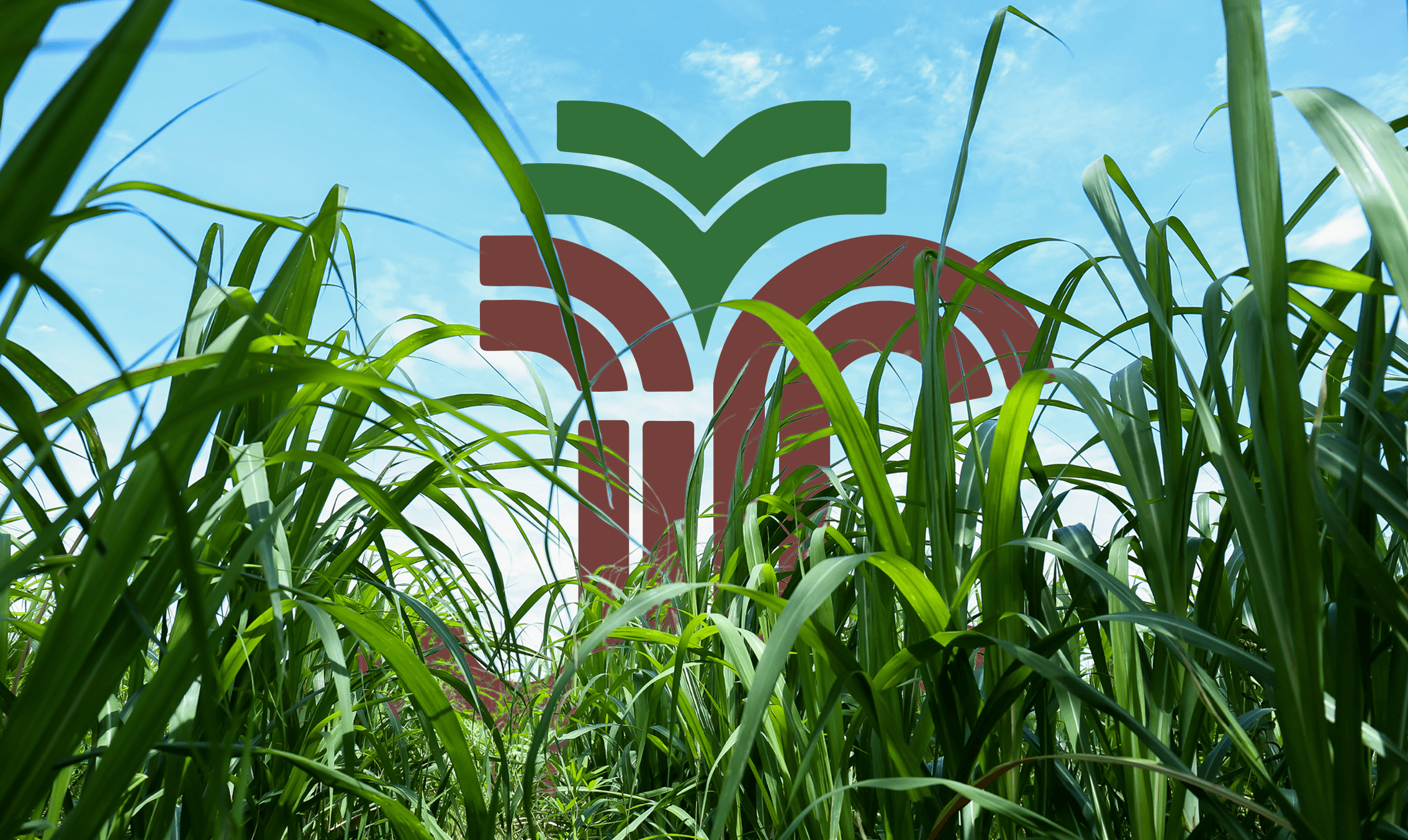
Logo + brand identity (premium-traditional-honest)
15+ branding collaterals (led + delegated)
Informational website (sitemap → dev handoff)
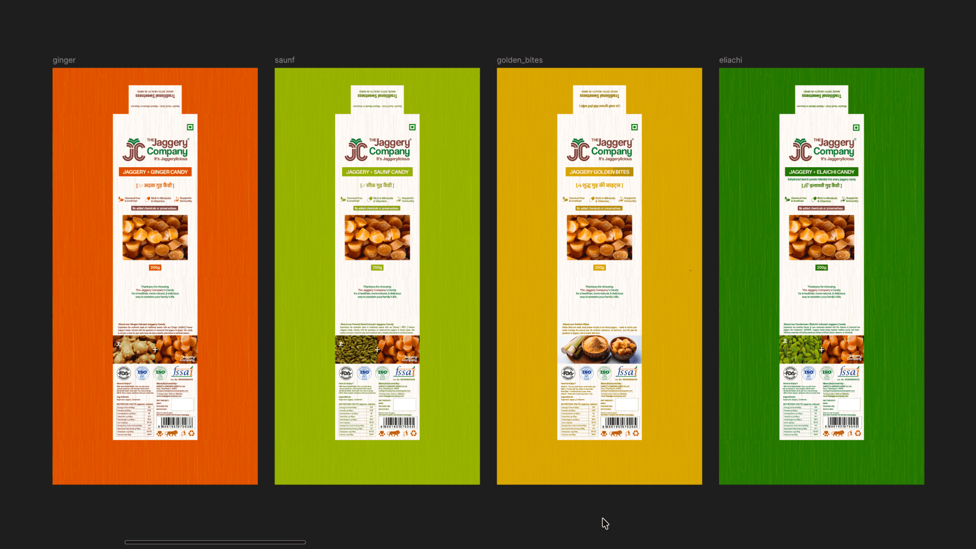
10+ SKUs packaging (shelf-ready)
Ongoing: ecommerce website redesign
The success of this project depended on clarity, not decoration.
About the project
A full-stack product designer brought in with only brand name & founder requirements. I was shaping a brand people would buy & retailers would stock. I led branding, website design (handoff to dev) & packaging across 10+ SKUs, while maintaining a consistent premium-traditional-honest system.
Initial Discovery (Week 1):
Met with founder/CEO + marketing team. They had finalized the brand name and validated online presence. My starting point: Name + requirements only. Everything else was my responsibility.
My Process & Tools I used :
Discovery → Competitive Research → Brand Strategy → Logo Design → Branding Collaterals (1-2 months) → Website Design → Packaging Design → Launch → Iterate on new SKUs + feedback
Figma: Logo design, brand identity, website UI, collaboration, Pacdora: Packaging mockups + presentation, Adobe Illustrator: Print-ready packaging files (CMYK), Google workspace: Stakeholder alignment docs
Collaboration:
- Founder/CEO for strategic direction
- Junior designer for collateral execution (business cards, banners, flyers, etc.)
- External print partner for production quality assurance
- Developer (separate team) for website development from my handoff
Timeline & Delivery:
Branding (Logo + Identity): 1-2 weeks research → 1 week design → First-go approval
Branding Collaterals Checklist (15 items): ~1-2 months (junior + me)
Website Sitemap & Design: ~1 month → First-go approval
Packaging Design per SKU: ~1 week per product, then iterate with feedback
Ongoing: New SKU launches, customer feedback integration, current website redesign for ecommerce
Every design choice was evaluated through two lenses:
→ Does this reinforce the brand’s positioning?
→ Does this improve usability and clarity for the end user?
The outcome was a system capable of supporting both immediate launch needs & long-term iteration.

Challanges, Solutions & Approach
Building a brand from zero is risky: positioning clarity, market differentiation & trust perception all depend on design choices. A key challenges was maintaining clarity while working across multiple layers — brand identity, UI components, layouts, and real product constraints — without over-engineering the system.
The approach was intentionally modular:
Establish clear brand primitives (color, type, tone)
Translate those into reusable UI patterns
Apply patterns consistently across flows and screens
Design decisions were documented early to reduce ambiguity, enable faster iteration, and support future contributors.
This approach balanced speed with intentionality, allowing the product to evolve without losing coherence.
Key Challenges & Design Decisions
#1 Differentiating a Commodity Product
PROBLEM: Jaggery is a commodity. How do I make "premium jaggery" credible?
SOLUTION: Audited 10+ local & national brands across identity, packaging, web, and positioning to identify gaps.
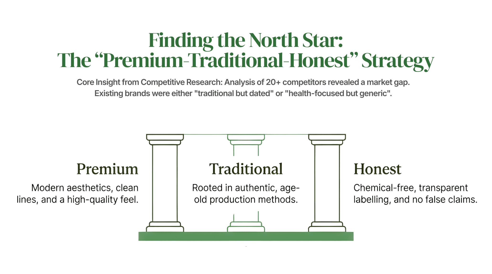
RESULT: I positioned the brand as "premium-traditional-honest"—modern by look but rooted in real product quality.
#2: Designing Without Established Market Presence
PROBLEM: No brand history, no customer base, no digital presence.
SOLUTION: I led discovery with founder to crystallize their core belief: "Chemical-free jaggery that won't curdle milk." This became the design north star.
RESULT: Every design decision (logo, packaging, website copy) reinforced this claim, building immediate credibility.
#3: Scaling Design Across 15 Collateral Items + Website + Packaging
PROBLEM: Massive scope, tight timeline, one designer (me).
SOLUTION: Established a modular design system in Figma. Created reusable components for logos, typography, spacing, color. Delegated collateral execution to junior designer while I owned strategy + final approval.
RESULT: Delivered 15+ collaterals in 1-2 months without losing quality.
#4: Using Packaging as a Trust Signal
PROBLEM: Retail shelf competition is visual + informational. Jaggery blocks look similar across brands. How do I make ours pop + build trust?
SOLUTION: I researched competitor packaging, identified that most hid ingredient info or made it hard to read. I prioritized clarity: large, legible ingredient list, special claim ("Won't curdle milk") made prominent, premium unboxing feel.
RESULT: Retailers & customers immediately recognized the difference. Customers reported: "All information was clearly available to us."
Strategic Approach Across Each Steps (Skip if needed)
Competitive Research Phase
Analyzed 10+ jaggery brands: logo aesthetics, packaging design, social presence, website strategy
8 user interviews → 4 key pain points identified
Identified gaps: most were either "old traditional" or "trying too hard modern"
Opportunity: "Premium-traditional-honest" positioning with honest, clear design
Brand Strategy Definition
Worked with founder to crystalize: chemical-free, trustworthy, rooted in tradition, modern presentation
Core differentiator: "Won't curdle milk" (product truth, not marketing fluff)
Tone: Honest, educational, premium
Logo Design & Identity System
Explored 30+ concepts (Pinterest, Behance, Google Images for inspiration)
Tested typography + color options
Presented 3 final logo directions with personality tone + theory doc
First-go approval on selected direction (premium-traditional aesthetic)
Branding Collaterals
Created 15-item checklist (business cards, letterhead, envelopes, banners, flyers, paper bags, tote bags, certificates, canopy, etc.)
Maintained consistency across all touchpoints
Junior designer executed variations; I directed and approved each batch
Website Information Architecture
Founder requested awareness + info site (not ecommerce—wise decision to test product first)
I created sitemap: Home, About, Products (summary + individual pages), Blog, Business, FAQ, T&C
Designed with clarity-first approach: easy navigation, product info prominent, trust signals visible
First-go approval; described as "world-ready"
Packaging Design System
Designed for retail shelf impact: hierarchy, legibility, premium feel
Core SKUs (powder, candy, blocks) established system
Extended to specialty (ginger candy, fennel candy with transparent windows) and gifting (Golden Bites)
Rapid iteration: 1 week per SKU, feedback → minor updates → print-ready in Illustrator (CMYK)
Iteration & Growth
Post-launch: customer feedback showed high satisfaction ("info was clear," "we trust the product")
Founder estimated 10,000+ repeat customers
Expanded to 700+ retailers domestically
Launched new product lines (candies, gifting range)
Current: redesigning website to integrate ecommerce (half-informational, half-transactional)



Key Decisions, Outcomes & Impact
Designed clarity into every touchpoint—logo, packaging, website, collaterals—so customers and retailers immediately understood what The Jaggery Company stood for. Result: rapid adoption, high repeat rates, and retail trust.
The most impactful decisions centered around systemization over surface-level polish.
By prioritizing consistency, hierarchy, and reusability, the final design system improved internal alignment and reduced design ambiguity across touchpoints.
The resulting product experience felt more intentional, confident and easier to extend — supporting both immediate launch goals and future roadmap needs.
Rather than delivering isolated assets, the project resulted in a shared design language that strengthened both brand perception and product usability.
Outcomes & Metrics:
100,000+ boxes sold (first year)
10,000+ repeat customers (founder estimate)
700+ retail locations domestically
Zero major design revisions (all feedback = minor updates)
Website approved first iteration, new redesign also approved ("world-ready")
Packaging praised by customers for clarity
Brand recognition grew enough to justify new SKU launches (candies, gifting)
Customer Feedback (Direct):
"All the information was clearly available to us and we love it"
"We trust this product because we understand what's in it"
"It doesn't feel like a generic commodity—it feels premium"
Retailer Feedback (Founder's Report):
"This brand stands out on shelf"
"Customers ask for it by name"
"We're confident in the product quality based on packaging honesty"
My Biggest Wins:
Went from "only a name" to a complete, market-ready brand in under 3 months
Branding + collaterals + website + packaging launched cohesively
Rare for early-stage FMCG brands
Designed clarity into everything
No jargon, no false claims, no visual confusion
Customers felt respected, retailers trusted the brand
This became a competitive advantage
Scaled the brand identity seamlessly across 10+ SKUs
New products (candies, gifting) felt like natural extensions, not disparate launches
Design system proved its value
Contributed marketing insight beyond design
Founder noted they wanted "marketing perspective," and I provided it
Helped position the special claim ("Won't curdle milk") as hero, not afterthought
Suggested ecommerce hold, which proved strategic
Built a brand that customers and retailers chose to repeat
10,000+ repeat customers isn't luck—it's trust
Packaging clarity + website transparency created that trust
LIVE PROOF
Website: The Jaggery Company
Amazon: The Jaggery Company on Amazon India
Instagram: @thejaggerycompany
Behance: View
The brand has been validated in domestic markets and is now positioned for retail e-commerce expansion, launching on Amazon through a newly designed hybrid website and scaling further.
Discover more


