Client
Type
My Role
Duration
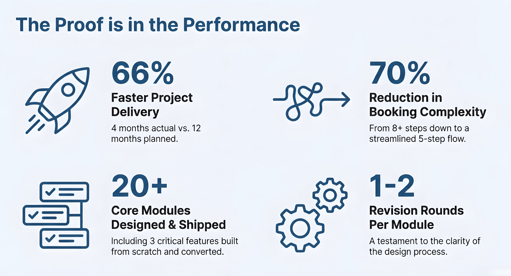
A complete healthcare mobile platform redesign that reduced appointment booking complexity by 70% and delivered a production-ready app in 4 months instead of the planned 12. Led design strategy, UX flows, and UI while managing full creative control and client collaboration.


Problem Definition
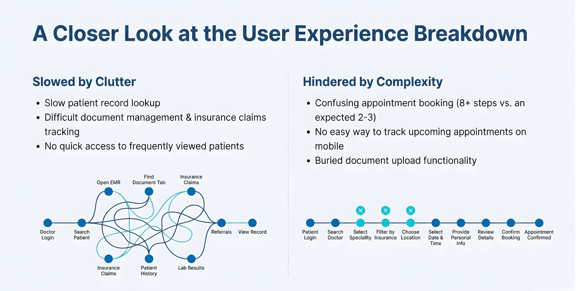
Existing web/app platforms suffered from "multi-step, unclear workflows, non-trusted interfaces" that frustrated both doctors and patients.
Core User Pain Points
Doctors:
Critical pateint data was buried under multiple navigation steps
Patients:
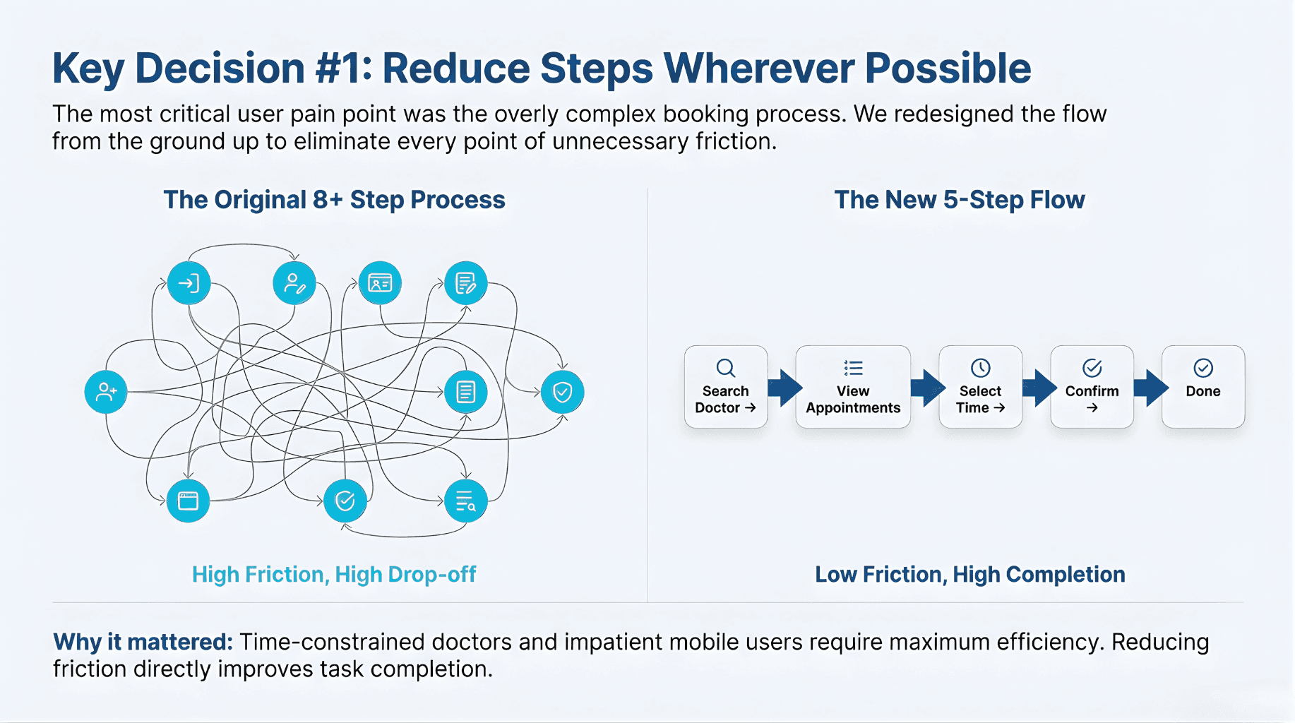
An 8+ step appointment booking process created confusion & led to high drop-off rates.
Business:
The competitor platform were failing to deliver the core value & hence creating a competitive disadvantage, and we don't want it.
About the project
Loktore started as a web application with significant usability issues. The platform needed a complete mobile-first redesign that simplified complex workflows while maintaining enterprise-level healthcare functionality. This wasn't just a web-to-mobile conversion, it was a reimagining of how doctors and patients interact with healthcare data.
The Dual-App Challenge
Unlike typical healthcare apps, Loktore required two completely separate ecosystems:
- Doctor App: Fast access to patient records, document management, insurance/claims tracking and more
- Patient App: Self-serve appointment booking, appointment tracking, document uploads and more
Both apps had to work together seamlessly while respecting completely different user workflows and pain points.
What We Built
- 20+ Core Modules designed and shipped
- 3 Critical Features: Appointment Booking/Tracking, Claims & Insurance Management, Document Management
- Hybrid Approach: 50% converted from existing web features + 50% built from scratch with updated requirements, as the time were limited
- Live Apps: Currently active on both iOS and Android with active user base
Tech Stack Used:
Figma (design & collaboration), AI Tools: Perplexity, Stitch, Lovable, Gemini, ChatGPT (validation & feedback), Google Workspace (documentation), Microsoft Teams (Meetings & Updates)

Challanges, Solutions & Approach
The original web application had multiple critical UX issues that translated to poor mobile experiences. The core problem wasn't just technical, it was about user behavior and information architecture.
Challenge #1: Information Overload & Unclear Workflows
Confusing workflows were burning out doctors and losing patients. I turned a cluttered mess into a clear, one-way path.
Challenge #2: Competitive Disadvantage
Our competitors were bloated. We chose to win on simplicity—giving power users the depth they need without the headache.
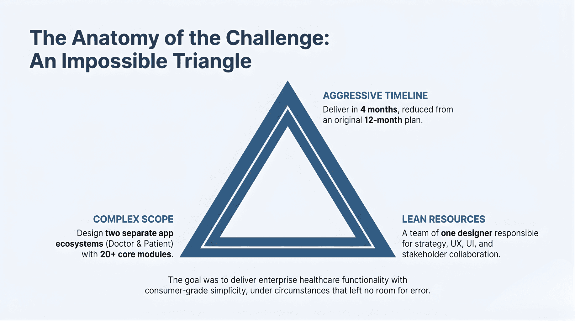
Challenge #3: Aggressive Timeline vs. Scope
I had 4 months to ship a 12-month roadmap. As the solo designer, I built a modular system to keep us moving at breakneck speed.
Challenge #4: Design-to-Development Clarity
Web logic doesn’t work on mobile. I reimagined the entire hierarchy and used AI validation to get stakeholders & especially developers on board fast.
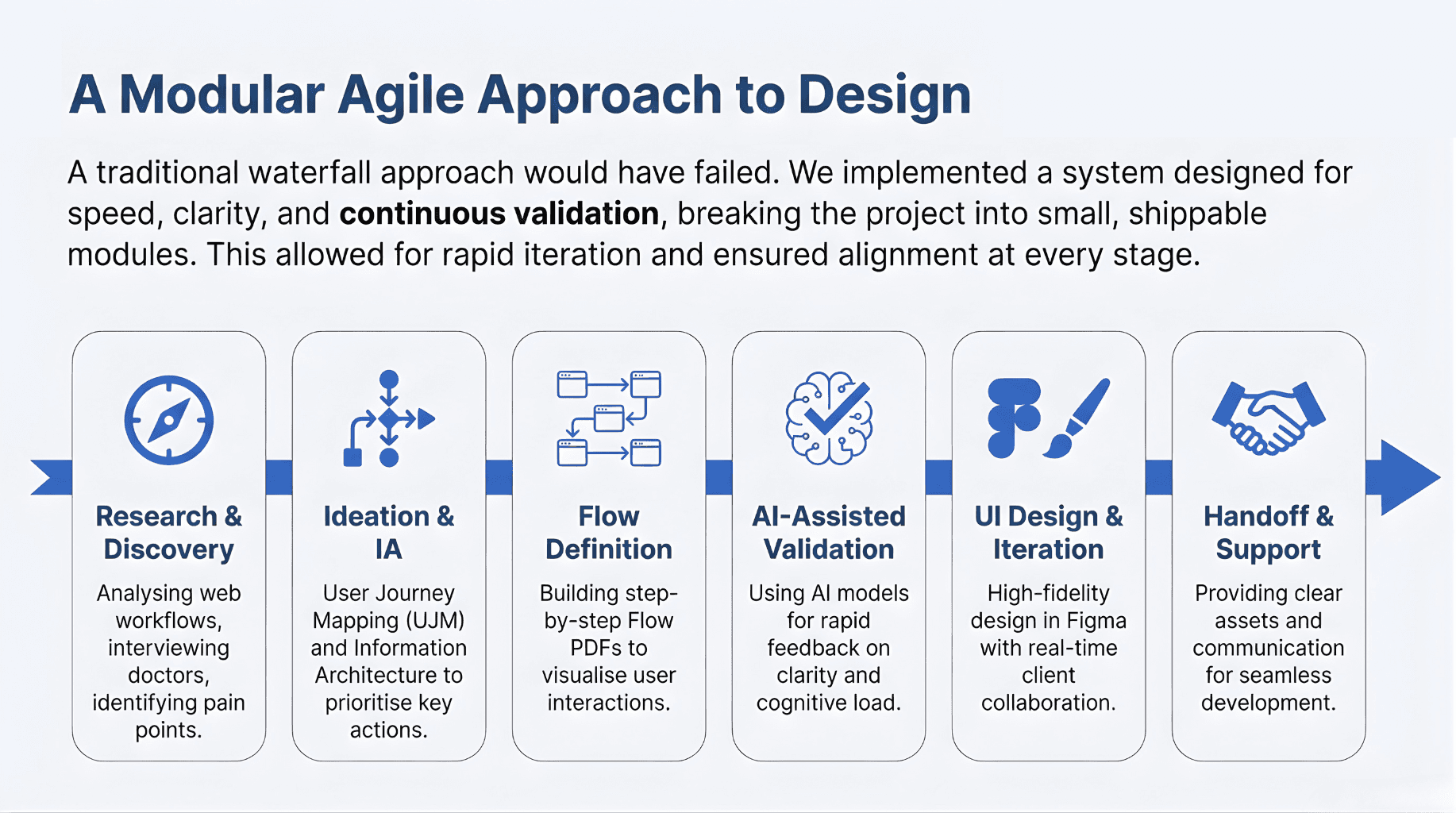
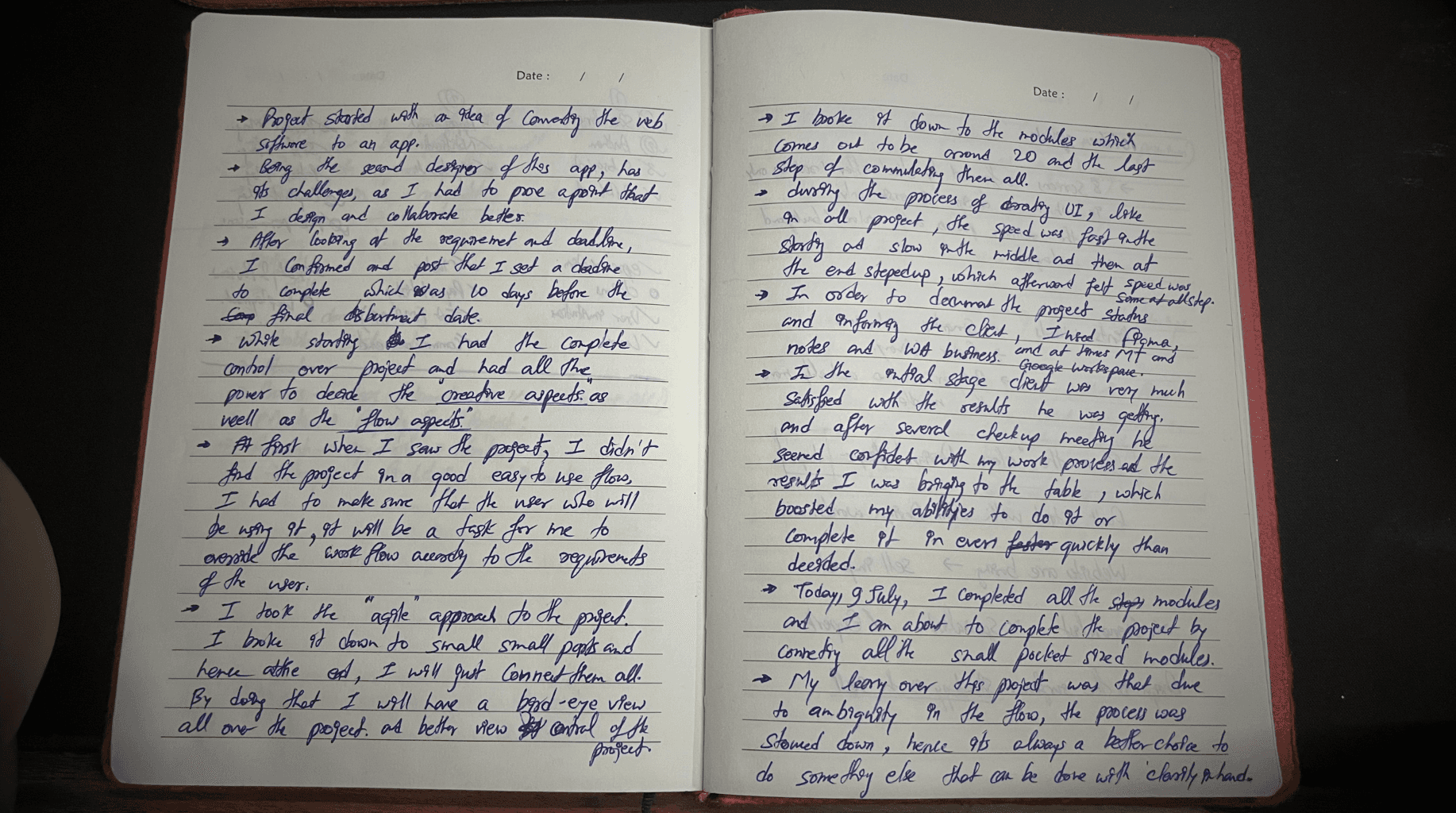
Instead of a traditional waterfall approach, I implemented an Agile design methodology that broke the project into small, shippable modules. This allowed for rapid iteration, early client feedback, and design validation at each stage.
Research & Discovery Phase
Analyzed original web workflows, interviewed doctors and found the 6-step booking bottleneck that was losing patients.
Ideation & Flow Clarity
I mapped new user journeys and IA to put the most important tasks front and center & Built Flow PDFs showing step-by-step user interactions
Design Validation Using AI
To hit the deadline, I used AI to stress-test my flows for accessibility and cognitive load. Got actionable feedback without formal user testing (necessary given timeline constraints)
UI Design & Iteration
Real-time Figma collaboration cut our revision cycles down to just 1–2 rounds.


Key Design Decisons, Outcomes & Impact
The project delivered 4 months ahead of schedule with exceptionally high client satisfaction. More importantly, the design methodology proved that with clear processes, even aggressive timelines produce quality results.
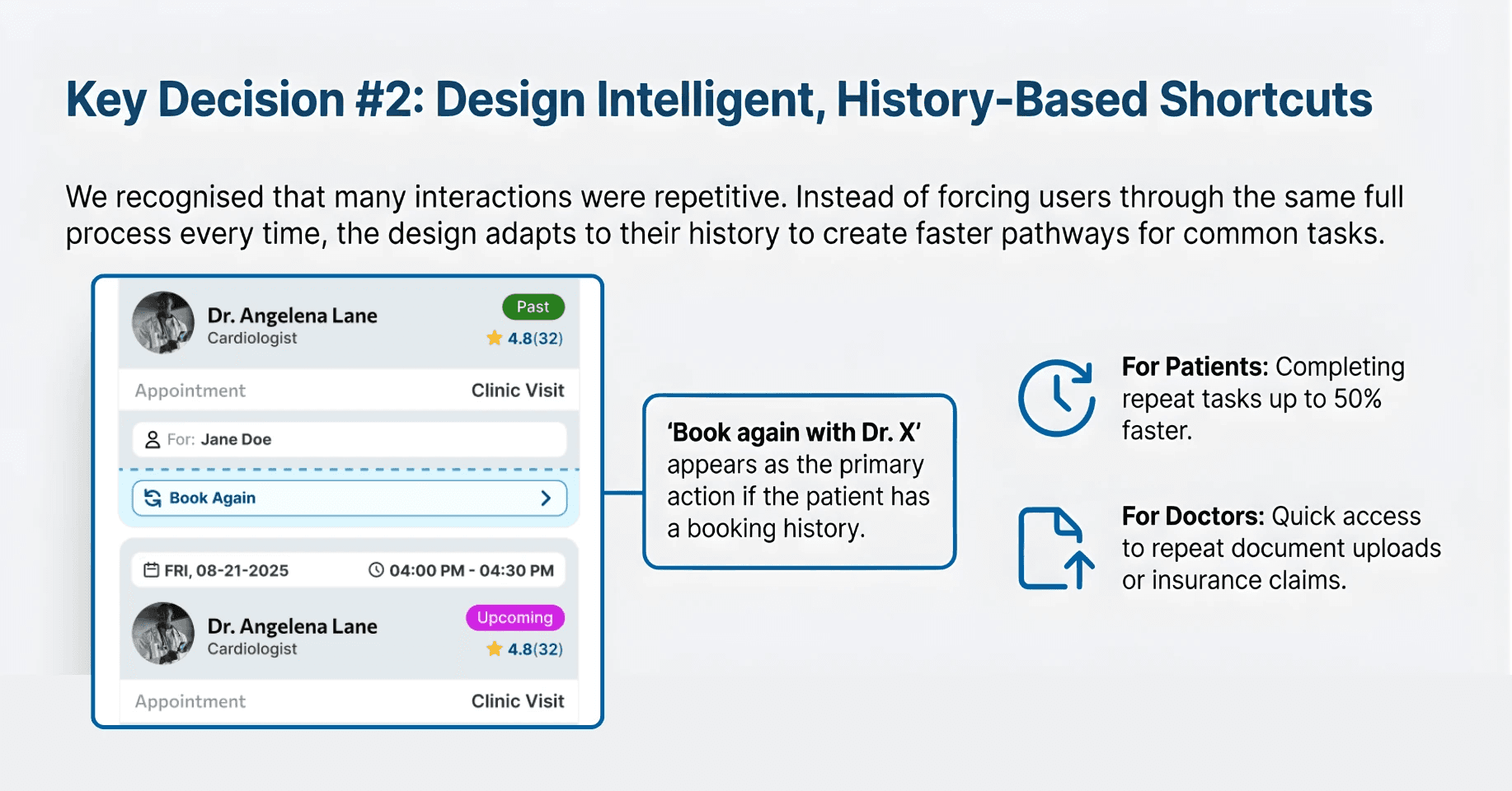
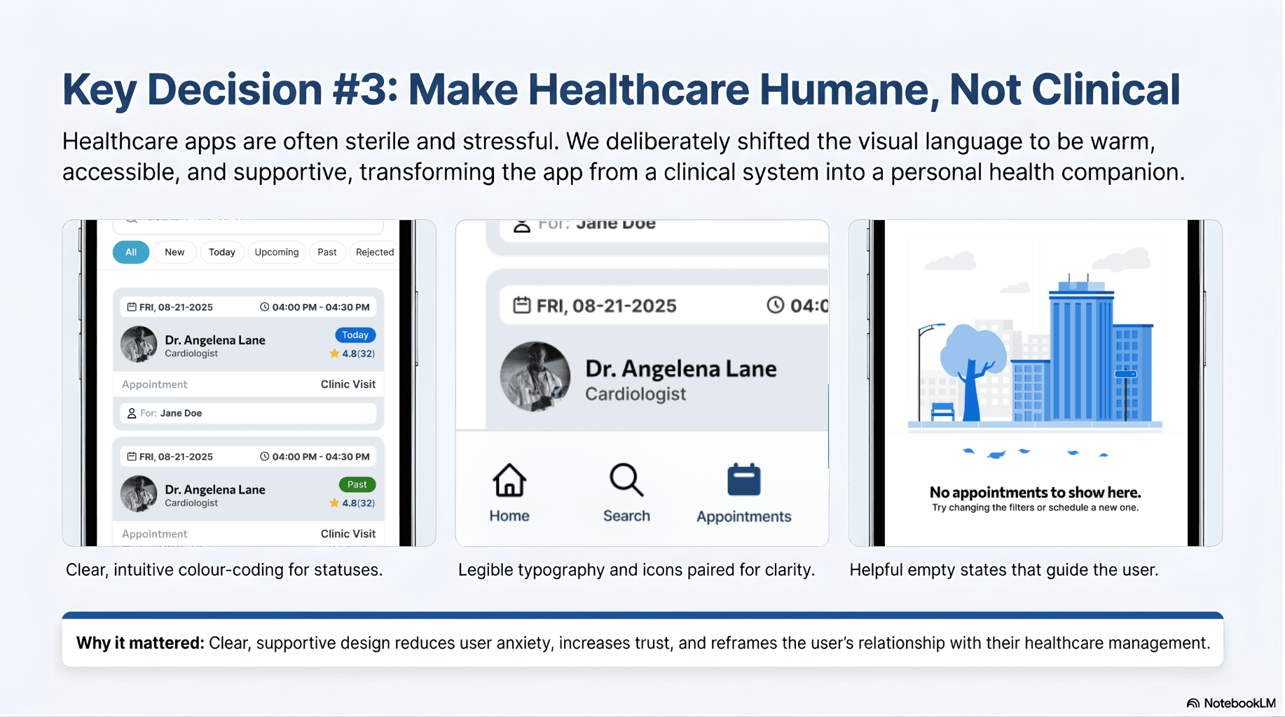
Timeline Achievement
Expected delivery: 12 months
Actual delivery: 4 months (66% faster)
Scope: 20+ modules, fully designed and shipped
UI Screens Designed: 400+
Status: Live on both App Store and Play Store with active users
Client & Stakeholder Feedback
Client initially questioned some design decisions (e.g., information hierarchy, feature prioritization)
Client became fully confident after the reasoning behind each design decision was explained.
During final reviews with client, stakeholders, and experienced developers (6+ years exp), presented each screen with clear explanations, were impressed and understood design intent without constant meetings.
Outcome: Design remained consistent across 20+ modules with minimal dev handoff confusion.
Key Learning
The main insight from this project: Clarity of process eliminates ambiguity in outcomes.
By following strict Research → Ideation → UJM → Flow → UI → AI Validation → Client Collaboration, I removed guesswork and proved that design decisions (not gut feelings) lead to confident stakeholders.



Discover more


