Client
Type
My Role
Duration
Designed a mobile-first Android app for utility field teams to manage infrastructure assets across Structures and Towers—replacing manual, paper-based inventory tracking with a faster digital workflow. I created the IA, wireframes, and final UI for the key flows (login, inventory lists, search, asset details, status/completion and download/print confirmations), and handed it off dev-ready within 8 weeks. All visuals, client identifiers, and operational specifics are masked because the project is under NDA.


Problem Definition
Design an internal Android app that helps field teams quickly check stock position and status for utility assets—without relying on paper trails or slow, manual lookups.
The starting point
The workflow was heavily dependent on manual records and fragmented references, which made on-site verification slower than it should be.
Users needed a fast way to access asset information on mobile using the same labels/codes they already work with (e.g., tower codes like DNO/DN30 and structure categories like gantry items).
The market / field reality
This is a field-first environment: operators work under time pressure and can’t afford deep navigation or ambiguity.
Asset data is naturally complex and hierarchical, but the app experience must feel simple and predictable.
The core problem
How might I make it effortless for a field operator to:
Find the right asset (Structures vs Towers).
Confirm its stock/status quickly (clear “COMPLETED” visibility).
Access supporting references like drawings/download prompts when needed.
About the project
This was not a consumer app—it’s a field tool. The people using it don’t have time to “learn” an interface. They need to pull up the right asset fast, confirm status, and move on.
What made the domain tricky is that the same user needs to work across two different mental models: Structures and Towers.
Structures are browsed by asset types and subtypes (gantry column/beam, station road structures, etc.), while towers are frequently accessed via short codes like DNO/DN30.
So my job was to design one coherent product experience that still respects how the data is actually used in the field.
I delivered wireframes → UI for the key flows (login, browse, filter, search, detail, status updates, downloads) with a clean handoff ready for development.
Design Scope
12+ core modules
15+ designed screens
2 distinct asset categories (Structures & Towers) with separate workflows
Complete component library (buttons, cards, filters, modals, lists)
User flow documentation for 8+ primary journeys
Accessibility considerations (glove-friendly touch targets, high contrast, large type)
Challanges, Solutions & Approach
The core challenge was turning messy, deeply technical asset data into a mobile experience that’s fast in the field, consistent across categories, and safe from user errors.
Challenge #1: Deep hierarchy on a small screen
The inventory data naturally wants to become a multi-level drill-down (type → subtype → item → details).
On mobile, that becomes “tap fatigue” and users start making mistakes or giving up.
Challenge #2: Two categories, two behaviors
Structures are typically browsed and filtered.
Towers are often searched by code and verified quickly.
Challenge #3: Status updates must feel reliable
Operators need to confidently mark items as completed and instantly see the status reflected in the list, not hidden inside forms.
Challenge #4: Field constraints
This type of work often happens under time pressure and in environments where attention is split (walking sites, calling teammates, referencing drawings).
I treated this like a systems design problem: reduce navigation depth, make states obvious, and keep patterns consistent across Structures and Towers.
1) I locked the navigation model early
I separated “Structures” and “Towers” as first-class destinations, so users don’t mix contexts.
That single decision removed a lot of confusion and let each section behave the way users expect.
2) I designed for “find fast”
For Structures: filter + browse patterns, built around dropdown selection and scannable lists.
For Towers: search-first behavior with short codes (DNO/DN30) and fast results.
3) I kept actions close to the data
Completion is shown clearly (✔ + “COMPLETED”) at the list level, so users can scan progress without opening each item.
This reduces steps and reduces “did it save?” anxiety.
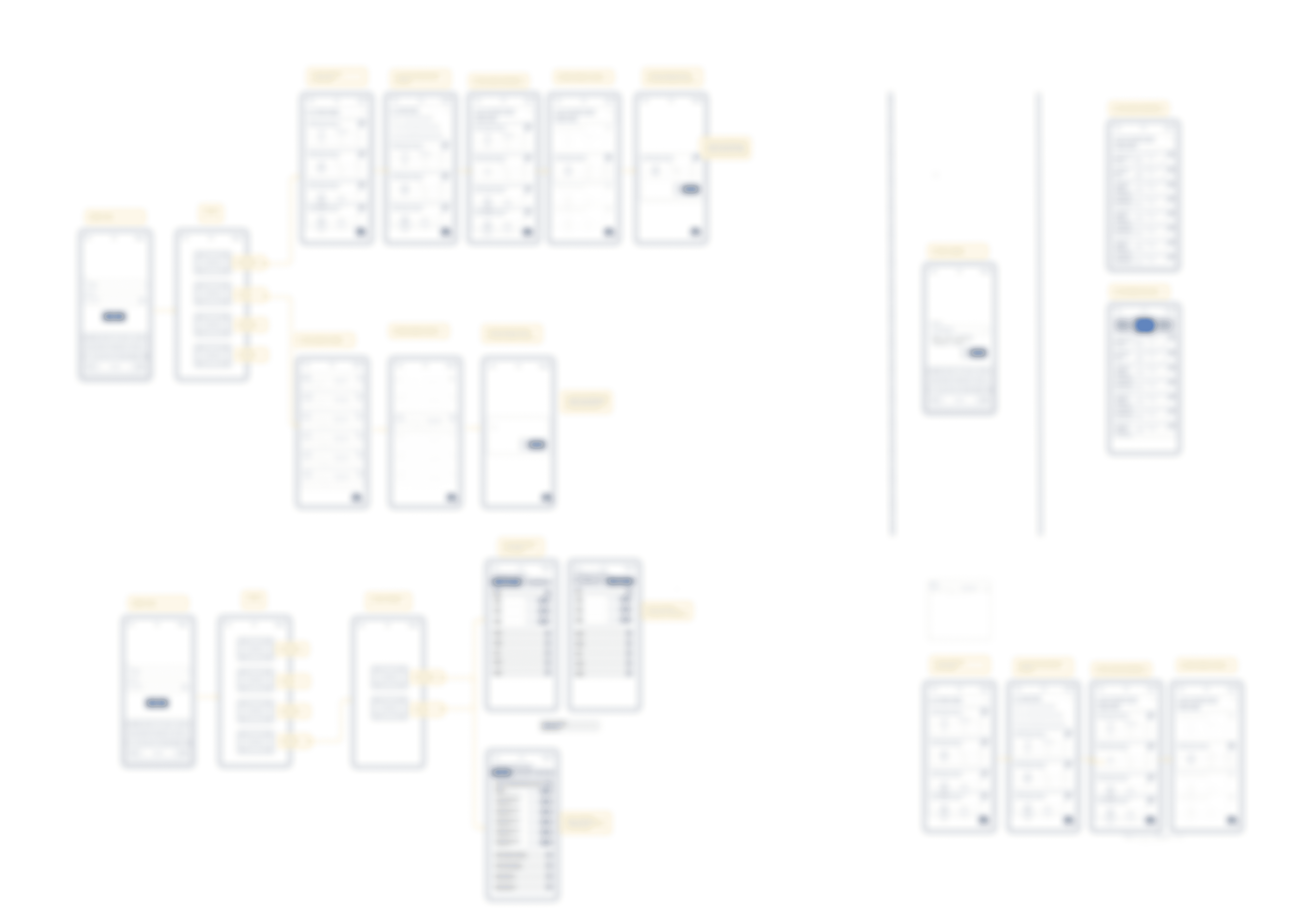
4) I documented flows in wireframes before polishing UI
The wireframe set focused on the exact operator journey: login → choose category → locate item → check details → update status → download/view when needed.
That ensured the UI phase wasn’t just visual—it was grounded in usable structure.
Final Information Architecture
Home → Structures / Towers → List → Detail → Status update / Download.
Key Design Decisons, Outcomes & Impact
The output was a clean, dev-ready design for a field inventory app that can scale across many asset types while staying easy to operate.
Key decisions
Decision #1: Split the product into two clear workspaces
I used distinct “Structures” vs “Towers” destinations so users always know what dataset they’re working in.
This mirrors real workflows: browse/filter structures, search towers by code.
Decision #2: Reduce depth using dropdowns + search instead of nested menus
The wireframes show repeated use of dropdown selection and quick listing, instead of forcing multi-level back-and-forth navigation.
This is faster in the field and easier to explain to first-time users.
Decision #3: Make completion status impossible to miss
The UI shows “COMPLETED” and checkmarks directly in the list rows, not buried inside a detail form.
That supports quick scanning and reduces repeat work.
Decision #4: Confirm downloads explicitly
The UI includes a confirmation prompt like “Do you wish to download…” before saving documents/drawings.
That prevents accidental downloads and keeps user intent clear.
Outcomes
Delivered a complete wireframe-to-UI set covering login, structures inventory, towers inventory, search, and core status flows.
The app design makes asset status highly visible (completed states in lists) and supports fast lookup through search and filtering.
Sensitive naming and internal identifiers are intentionally excluded from the case study visuals and copy while preserving the workflow logic.
What I delivered
Wireframes covering core flows and states.
UI screens showing Structures/Towers inventory, search behaviour, completion states, and download confirmation patterns.
Designed for low patience
Field users don’t want options—they want outcomes. So I optimized for fewer decisions per screen, stronger hierarchy, and repeatable patterns.
Designed to prevent errors
Status changes and downloads are the two highest-risk interactions, so they get clear visibility and confirmation.
My Learning
Biggest lesson: clarity in IA + feedback states beats visual polish in field tools.
Current status
Deployed internally for field operations; usage numbers and operational details are withheld under NDA.
Discover more


